Mobile first is used in two senses. In design, it means starting a website from the small screen and scaling it up afterwards. In SEO, it means Google's mobile-first indexing: Google crawls, indexes and ranks your site based on the version a phone sees. Whatever is missing on mobile is, as far as Google is concerned, not there.
For a small business this has a very practical consequence: it matters little how good the site looks on the office computer if the mobile version is missing text, has menus that will not open or images that do not load. Here is what actually changes, what you should review and how to check it in ten minutes without paid tools.
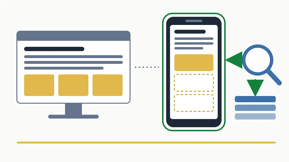
What mobile first means: design and indexing
The same expression names two things that complement each other but are not the same. It is worth separating them, because an agency can sell you the first and forget about the second.
| Mobile-first design | Mobile-first indexing | |
|---|---|---|
| What it is | A working method: the small screen is designed first and then scaled up to tablet and desktop. | The way Google reads websites: it uses the mobile version to index and rank. |
| Who decides | You and whoever builds your site. | Google. It cannot be switched on or off. |
| Risk if it fails | Visitors who leave because they cannot read or tap. | Content Google does not take into account, including for searches made from a computer. |
How Google's mobile-first indexing works
Google visits pages with a crawler that identifies itself as a phone (Googlebot Smartphone). Whatever that robot manages to load and read is what gets stored in the index and what is used to decide rankings.
- There is only one index. There is no index for phones and another for computers. The mobile version is the reference for every search, including those made from a desktop.
- It is not optional. Google has applied it to all websites for years; there is no box to tick in Search Console.
- The robot does not interact. It does not swipe, tap buttons or type. Content that only appears after a user action may be left out.
- It does not demand a particular design. A site without a dedicated mobile version is still indexed if it can be loaded on a phone, but it is assessed as it appears there.
What mobile first means for a business website
It depends on how the site is built. Google supports three configurations and recommends the first because it is the easiest to maintain:
- Responsive design: a single URL and a single HTML that rearranges itself to fit the screen. If that is your case, the content is already the same and the risk is low; you only need to watch what gets hidden or loaded late.
- Dynamic serving: the same URL serves different HTML depending on the device. Here content differences can creep in.
- Separate URLs (the classic
m.example.com): two sites to maintain. This is where most mismatches appear: trimmed copy, different meta tags, structured data that only exists on desktop.
Company websites built on a content management system with a current theme are usually responsive. Where I tend to find problems is on older sites with a separate mobile version, on shops with “lightweight” phone templates and on pages where someone decided there was “too much text” for mobile and hid it. This kind of review is part of the basic technical SEO of any website.
What to check: an eight-point list
- The same content. Copy, headings, tables and FAQs must be on mobile exactly as on desktop. You can fold them into accordions or tabs to save space; what you cannot do is remove them.
- The same titles and meta descriptions. The
titleand the meta description must match on both versions. - The same robots directives. A
noindexornofollowon the mobile version alone takes the page out of Google. - Accessible resources. Googlebot must be able to fetch the CSS, JavaScript and images; do not block them in robots.txt.
- Lazy loading done properly. Loading images as the visitor scrolls is fine. Loading the main text only when the user taps “Read more” is not.
- Equivalent images and videos. The same reasonable quality, the same alt text and formats Google supports.
- Identical structured data. The markup must be on both versions and point to the right URLs; it is explained in the structured data guide.
- The viewport tag and usability. Without
<meta name="viewport" content="width=device-width, initial-scale=1">the phone shows the site in miniature. Also check the font size, the spacing between buttons and that no pop-up covers the content on arrival.
Loading speed on mobile is a topic of its own: it is covered in the guide to web speed and SEO.
How to check it in ten minutes
- With your own phone. Open the three or four pages that bring you customers (home, services, contact) and compare them with the computer next to you. Is a paragraph, a table or a menu link missing?
- With URL Inspection in Search Console. Paste a URL, run the live test and look at the screenshot and the HTML Google fetched. That shows exactly what the mobile crawler reads. If you have never used it, follow the guide on how to use Google Search Console step by step.
If you would rather we looked at it, the free initial analysis includes this mobile-version check on your main pages.
The mistakes I see most often
- Copy trimmed “because it is tiring on mobile”. An accountancy firm in Sabadell with a full services page on desktop and three lines on mobile competes with those three lines.
- A mobile menu with fewer links. Pages that disappear from the hamburger menu lose internal links in precisely the version Google crawls.
- Reviews or technical sheets that load when a button is tapped. If the content is not in the HTML until someone interacts, Google may not see it.
In my view, the underlying mistake is signing off the site from the office computer. Whoever approves the design looks at it on a large screen; customers and Google look at it on a six-inch one.
Frequently asked questions about mobile first
Are mobile first and responsive the same thing?
No. Responsive is a technique: the same site adapts to each screen. Mobile first is a priority: the phone comes first, whether in design or, in Google's case, in indexing. A responsive site has an easier time, but it can still hide content on mobile.
My customers visit from a computer. Does it affect me?
Yes. Google uses the mobile version to index and rank all searches, desktop ones included. A B2B site visited mostly from computers is still assessed on what it shows on a phone.
Does content inside accordions or tabs count?
Yes, as long as it is in the page's HTML and not loaded only when the user clicks. Folding content to save space on mobile is an accepted practice.
How do I know whether Google crawls my site with the mobile robot?
In URL Inspection in Search Console, the crawl section states which robot crawled the page. You should normally see the smartphone crawler there.
In short
Mobile first, in SEO, comes down to one rule: what counts is what can be seen on a phone. Pick up yours, go through the eight points on the pages that bring you business and fix missing content first. If you want a second opinion, request the free initial analysis or see what our technical SEO service covers.